
How to Mix Gemstone Colors in a Bracelet
A practical color-design guide for mixing natural gemstone beads without making a bracelet feel random or overworked.
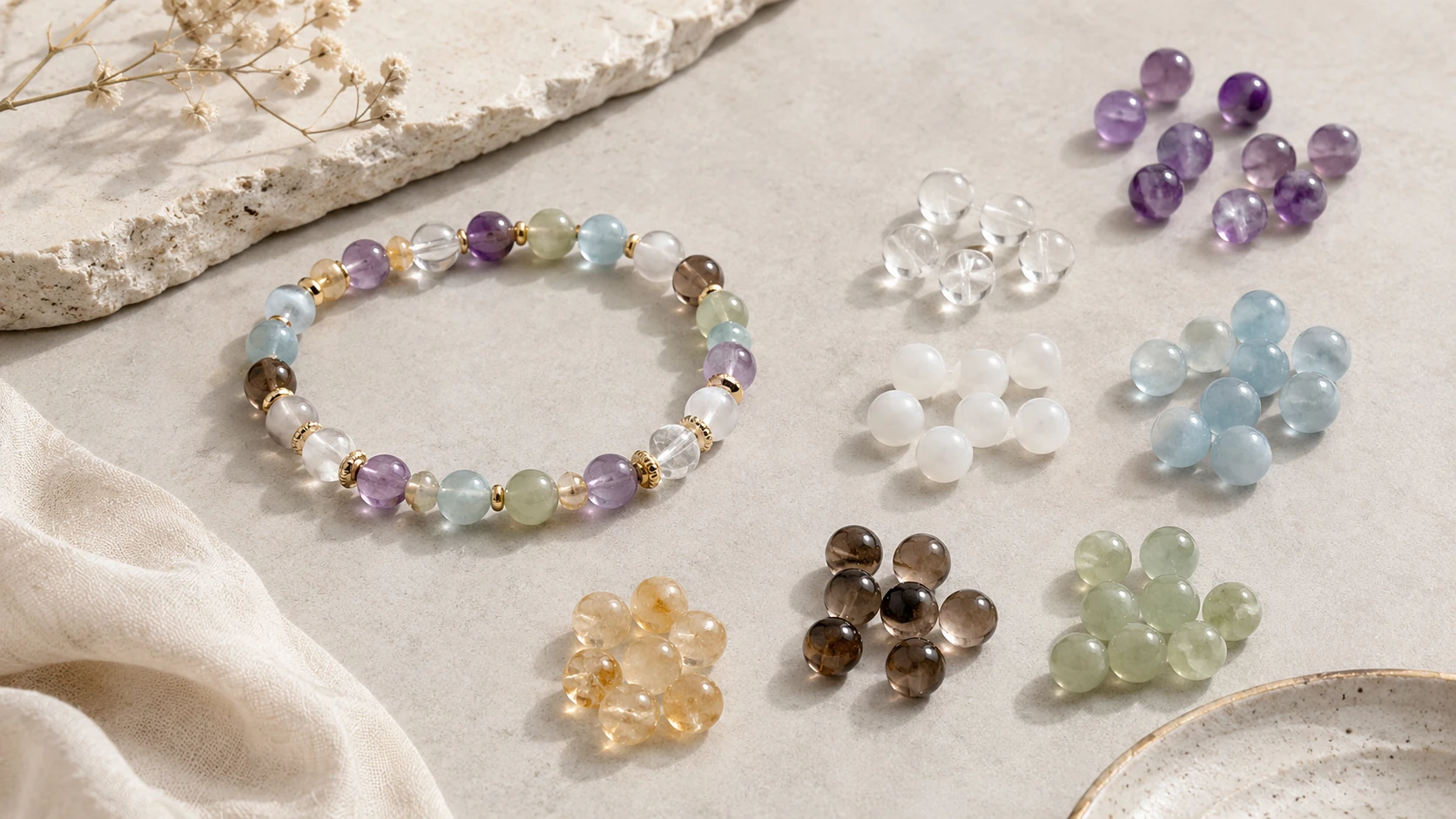
The easiest way to make a multi-color bracelet feel intentional is to decide on a color direction before selecting individual beads.
Start With a Palette, Not a Pile of Stones
The easiest way to make a multi-color bracelet feel intentional is to decide on a color direction before selecting individual beads.
A palette can be tonal, such as pale blue, clear and soft gray. It can be complementary, such as warm amber against cool blue. It can also be neutral with one controlled accent.
The important part is hierarchy. When every color is equally loud, the bracelet can feel fragmented. When one direction leads and the others support it, the design becomes easier to read.
Use a Dominant, Supporting and Accent Color
A simple way to organize color is to assign roles.
The dominant color establishes the overall identity of the bracelet. The supporting color creates depth or transition. The accent color appears less often and adds contrast or emphasis.
This does not need to follow an exact percentage. The principle is visual: one color family should usually feel more present than the others, unless you are deliberately creating a balanced rainbow or equal-repeat pattern.
Tonal Palettes Feel Quiet and Refined
Tonal palettes use colors that sit close together visually. Examples include aquamarine with clear quartz and milk quartz, or amethyst with pale lavender and smoky transparent stones.
Because the hue changes are subtle, texture and translucency become more noticeable. Tonal designs are particularly effective when you want the bracelet to feel calm, minimal or easy to wear with different clothing.
Contrast Creates Energy
Contrast comes from difference: light against dark, warm against cool, transparent against opaque, or saturated against muted.
Black agate paired with clear quartz creates strong value contrast. Citrine against aquamarine creates warm-cool contrast. Tiger eye beside milk quartz creates both color and opacity contrast.
Contrast works best when it has a purpose. Use it to create a focal point, define a repeated rhythm or separate sections of a bracelet rather than adding unrelated colors everywhere.
Let Neutral Stones Create Breathing Room
Clear quartz, milk quartz, smoky neutrals, black agate and other restrained materials can function like visual punctuation.
A neutral bead can separate two strong colors so they do not compete directly. It can also repeat throughout the bracelet to connect otherwise different gemstone families.
In design terms, neutral does not mean unimportant. It often gives the eye somewhere to rest.
Repeat Colors to Build Rhythm
A color that appears once may look accidental. A color that reappears creates structure.
Repetition can be regular, such as A-B-A-B, or more relaxed, such as placing the same accent color at several uneven but deliberate points.
You can also use mirrored repetition around a charm or center stone. This creates visual balance even when the bracelet contains several gemstone types.
Use Natural Variation Instead of Fighting It
Natural gemstones are not flat digital color swatches. One aquamarine bead may look slightly greener, one amethyst bead may be lighter, and one tiger eye bead may show more dark banding than another.
That variation adds depth, but it also means color planning should happen at the bracelet level. Judge the total flow of the palette instead of trying to force every bead into an identical shade.
This is one reason TerraBead emphasizes representative bead imagery and multiple examples of the same material: the material itself is part of the design language.
Match Color Strategy to Personal Style
Minimal wardrobes often work well with restrained palettes, clear stones and black, gray or brown anchors. More expressive wardrobes can support higher contrast and repeated accent colors.
There is no universally “correct” gemstone color combination. A useful combination is one that feels coherent and that the wearer actually wants to live with.
The purpose of a design guide is not to prescribe taste, but to make the choices easier to understand.
A Simple Three-Step Color Method
When you are unsure where to begin, use this sequence:
1. Choose the main color you want to notice first.
2. Add one supporting color that either sits close to it or intentionally contrasts with it.
3. Add a neutral or small accent only if the design still needs separation or energy.
Then repeat the chosen colors in a pattern. If the bracelet still feels busy, remove one material before adding another.
Frequently Asked Questions
How many gemstone colors should I use in one bracelet?
Two or three color directions are often enough for a clear design, but there is no fixed limit. More colors work best when repetition and hierarchy keep the composition organized.
What gemstones work as neutral colors?
Clear, white, smoky, black and soft gray stones can act as visual neutrals, depending on the rest of the palette.
Can I mix warm and cool gemstone colors?
Yes. Warm-cool contrast can be one of the strongest design tools. Use repetition or a neutral stone to keep the combination intentional.
Do all beads need to match exactly?
No. Natural variation is expected. The goal is overall visual balance, not perfect bead-to-bead color uniformity.
How do I make a colorful bracelet feel less busy?
Reduce the number of dominant colors, repeat key materials, and add visual space through clear or neutral beads.
Design It Your Way
Start with these ideas and build a bracelet that feels like you in TerraBead Design Studio.